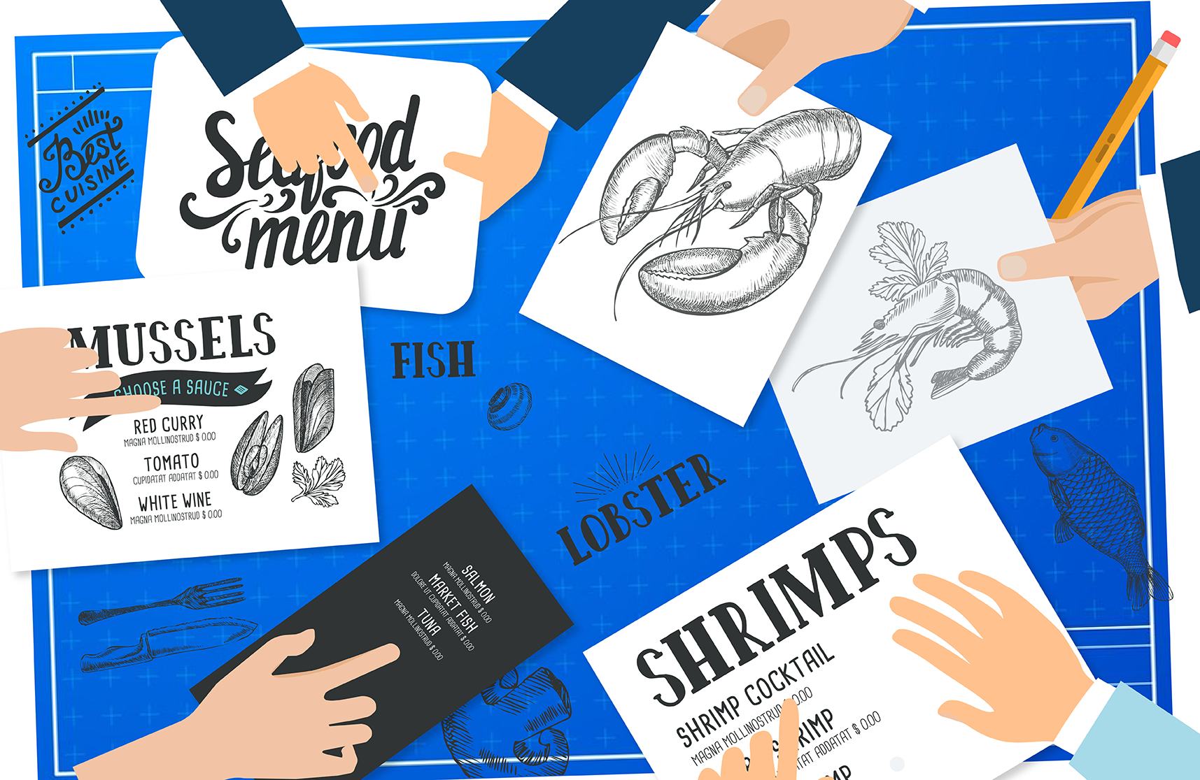
In part one we tackled what should be on your menu. Before creating a layout for your menu design, you should take into account all of the logistics regarding how many meals—and what kind of meals—your restaurant can produce.

Now that you’ve decided what meals you want to put on your menu you can start constructing a logical design flow for it. It makes sense to reiterate that design is more than just the aesthetics of something, rather it is more about making decisions according to a plan or outline and deliberately creating something with purpose.
Real-Estate
No, not real-estate in terms of the location of your restaurant (although this is very important) but rather where you place which items on the menu. The very first thing you need to do is group your items together in a logical way. Pasta dishes go together while seafood plates go together or separating your appetizers from your mains. This makes it easy for the customer to look through the menu.
However, not all parts of the menu are created equal. Studies have examined how people read a menu and have come up with a few surprising findings. Firstly, most people don’t read a menu as much as they scan it for something to eat. Not only that, but people typically scan in a particular pattern.
The first place a person looks when they open a menu is the middle-centre to top-centre of a menu. This is prime real-estate and you should think of this as the spot to place a key dish.
Next, because we read left-to-right, the second place they look is the top right hand of the menu as they go from menu-centre to the right. That’s followed by scanning across to the top-left of the menu. These three locations is where you should place your most expensive dishes or the ones you want to sell the most of. Research also indicates that people will also almost skip directly to items that fall directly below large headers so make sure to place your premium offerings just under your headers such as “mains” or “desserts”.
Eye Magnets
If there’s a particular dish you want to highlight, a simple trick is to create an eye magnet. Add something that will attract a person scanning the menu to a particular dish. This could be anything from a picture of the food, to a graphic, or even just simply placing a box around the item. Other visual elements are arrows or other pointers that directly point to the menu item. It’s surprising how well this works.
Photographs
Even though it sounds like it makes sense to hire a professional photographer to take delicious pictures of all your meals, the best advice is actually to use pictures sparingly—or not at all! Menus that feature lots of images of their food tend to be on the low-end and have been psychologically engrained into the average customer to think of the restaurant as a cheap eat. Use images with care and use only a few of them for your marquee items. Make sure the images are exceptional and appetizing looking. Avoid stock images since patrons want to receive exactly what they see on the menu.
Placement and being judicious with your elements allows you to rough your menu in but that still leaves fine tuning. We’ll conclude this series with a third part which will touch on colour, typography, and what exactly to write for your descriptions.


