Aislelabs continues to evolve our revolutionary products by adding exciting new features every few weeks.
As our solutions become more robust, it becomes very important to make sure that data is easily understandable and our users have a streamlined experience. We are adding a fresh coat of paint to our enterprise-grade solutions.
A Delightful Experience
Aislelabs has been building new features and tools into our platform from when we started more than 5 years ago. Over this period, we have received an incredible amount of user feedback from our customers, across industries located around the world. Since then, with every monthly product release, we have added new charts, graphs, and metrics to analyze visitor behaviour.
While some clients appreciate the ability to use the solution to get a bird’s eye view of their business, many others rely on the granular data that they can slice and dice with a deep dive. Meticulously designed to be user friendly and easy to understand, the platform none-the-less, must rise to the challenge of serving both needs.
This means the design guidelines set when the product was released quickly became outdated after a few release cycles. As engineers worked on customer feedback and added new tools or metrics, they took the creative liberty to design the look and feel of how information was displayed. With functionality working as the foundation for each new feature, we could easily solve and deploy the solution, quickly shipping it to our clients.
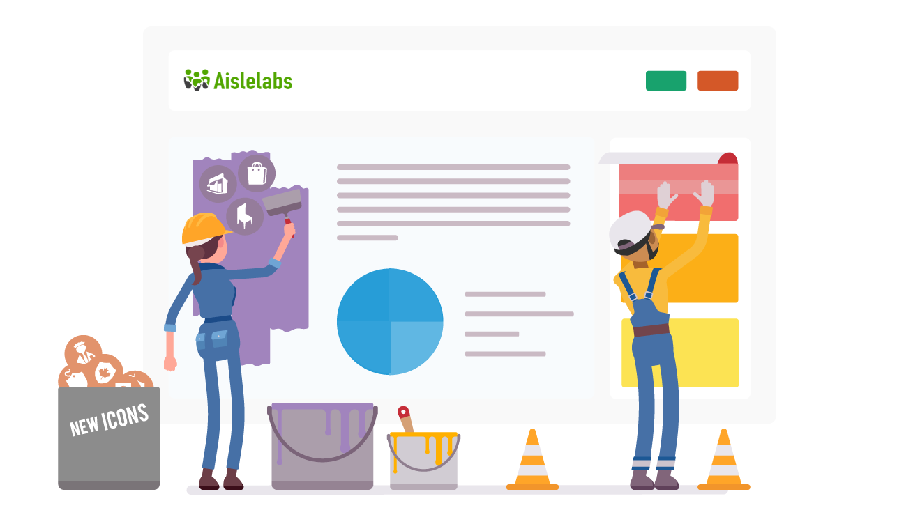
As we continued to evolve our design guidelines, engineering updates always outpaced it. It was about time for a top-down rethink of the design to remove clutter and reorganize what we had built. Since our core design UI sensibility still remains the same, this is more of a “spring cleaning” to tackle design inconsistencies that have cropped up over the years.
Charting a Better Course
An example of this are charts which is a key way to visualize data for analysis. However, if one type of chart is too often used it can look monotonous and risk confusing the user. On the flip side, by using too many different types of graphs and charts, you risk confusing the user and creating too heavy of a cognitive load.
Compounding all of this is by having so many reports and features, the iconography and terminology also needs to be easily understood and focused. As we continue to upgrade our products, our design team has been hard at work refining these experiences.
The Three Elements
To delight our users and create an exceptional experience using Aislelabs products, we’ve put a lot of time and thought into standardizing elements of the platform. To that effect, we’ve identified three key aspects to focus on: colour, terminology, and iconography.
Colour
Colour plays an important role in making our user interface more intuitive. By sensibly using colour in key areas we can draw user attention to specific sections of the UI and have it reflect different information.
The Aislelabs UI has many metrics that this update standardizes into colours for each. For example, Visits and Dwell are two key metrics that have been standardized with mint green always representing Visits and blue for Dwell time. This means, the user can simply look at the color and understand what metric the chart is for without having to read the label. The end goal is to have this consistency carry over to all 80+ reports, so each metric has its own unique color consistently displayed across reports.
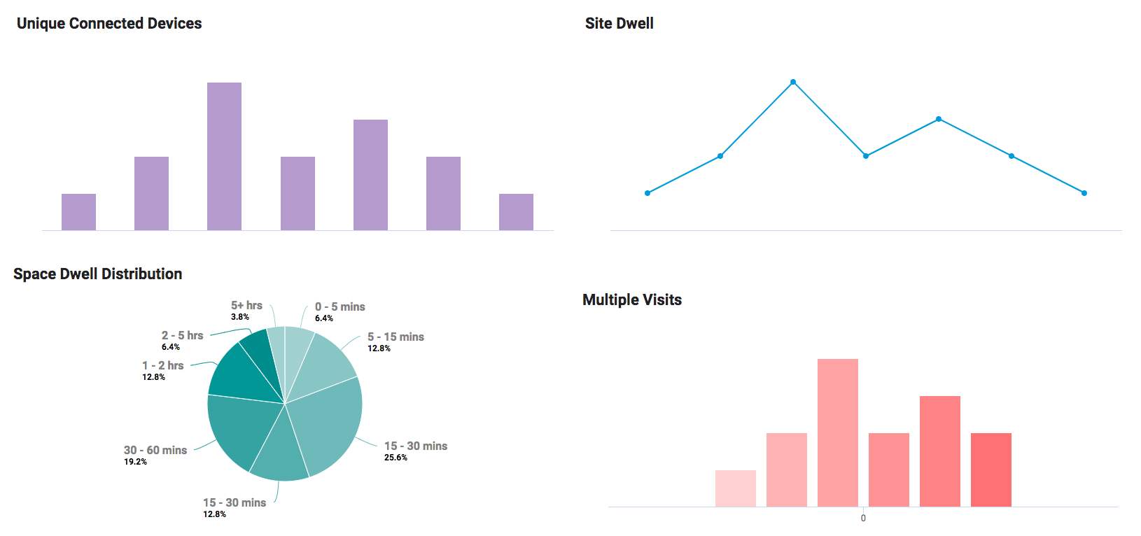
For example, let’s say a user accidentally clicked through to the space dwell report (indicated in dark teal) instead of site dwell (indicated in blue) which the user typically looks at. The user won’t have to know that site dwell is indicated with blue, but because they are used to seeing that colour for graphs and charts, having them in dark teal will look “wrong” and give them a gentle mental clue they are not on the right page.
These changes also add a splash of colour without overwhelming the user. This helps ensure that each report is visually appealing without being monochromatic or garish.
Labels & Taxonomy
The amount of terms used by Aislelabs has been consolidated and standardized. To combat using different terminology for each report, the language used in the Aislelabs solution has been made more consistent.
Another issue for terminology we’ve encountered has been establishing the difference between how our products deal with related but different terminology. For example, Aislelabs Flow detects anonymized data whereas Aislelabs Connect links an identity with each visit. While both deal with visitors in a given space, how the data is treated and what can be done with it is very different and should not be confused. In this case, each unique anonymized visit is just called a Visit in Flow. Whereas if the same visitor also connects to the WiFi, Aislelabs Connect refers to it as a Connected Visit. Visits and Connected Visits are similar but have different metrics, so we chose related colours mint green and dark green to represent them, respectively, in the UI.
We have streamlined the glossary of terms used throughout the platform. For example, in different reports we have previously used the terms Visits, Total Visits, and Site Visits interchangeably. Since all three terms describe the same thing, they have been truncated to just the term Visits across the platform. This glossary is now a standard element and there will be no deviation from it.
Icons
Aislelabs’ iconography has received updates as well with the biggest change coming in the form of the colour palette. Each icon is using greytone as a base but with a splash of bold colour to help denote what the icon is describing as we’ve laid out earlier.
![]()
The colour that denotes Unique Visitor is red, for example, so the icon used is a single person with a red shadow underneath. Likewise, blue is used for Site Dwell so the clock icon uses blue hour and minute hands.
Bringing it All Together
Using colour, icons, and labels we can demonstrate the updates we have made to the platform in action. Below (left) we have a screenshot of the old user interface which was thoughtfully crafted and easy to use. Crucial aspects stand out such as date, people filters, and call to actions. However, equal priority was given to all sections by showing similar kinds of graphs or charts that made it difficult for users to make sense of the data.
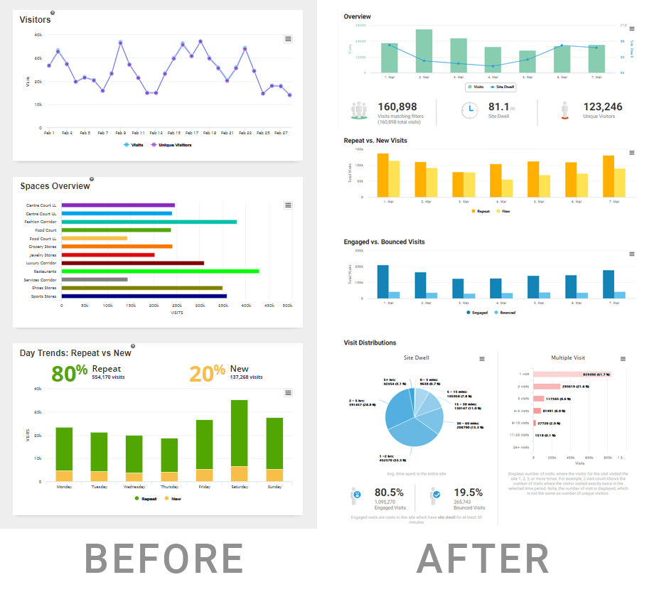
On the right, the refreshed design including single colours for each element indicating where the user should focus. Along with standardized colours, matching icons creates a cohesive whole and provides a pleasurable experience for users.
How We Keep Up
New features are constantly ideated in-house or from client feedback which are then given to our developers to build. Because updating the Aislelabs solution with new features and reports is ongoing, keeping the entire team aboard becomes a challenge.
To keep consistency, Aislelabs uses a built in style guide for our developers as a resource which they can consult while they build new exciting features our clients ask for. From here, the developers can reference the guide for colours, icons, and style all while keeping the overall look consistent. Included in this guide are icons, terminology, the types of charts or graphs used for specific metrics and more.
The guide is periodically updated as new icons and designs are refreshed by our designers who regularly hold meetings with our development team. Rather than introduce each new update piecemeal, several new design elements are worked on and then revised every few weeks on the platform. This is to keep the entire team appraised of new design updates without bogging them down with every small change.
More to Come
The Aislelabs solution is constantly changing, improving, and being refined. It is more of a living organism that evolves with changing technology and user needs. We’ve planned more changes due in the summer and cannot wait to introduce you to them!